Graffiti type foundry: Handselecta
March 21, 2007 on 11:10 pm | In related links | Comments Off on Graffiti type foundry: Handselecta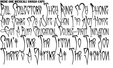
When I first designed this site, I spent a bit of time hunting around for fonts to use for the main logo. I considered using a “graffiti” font, but the few that were available were very disappointing. So I’m glad to hear that there’s now a type foundry that’s doing the job right: Handselecta. Their fonts are based on the handstyles of real writers like Giant, Mene One, and Espo, each one a collaboration between the writer and the font designer. Their aim is to bring the diversity of different cities’ characteristic handstyle traditions into the world of type.
PingMag has an excellent interview with Christian Acker, the foundry’s founder, full of choice quotes like this one on the relation between calligraphy and typography:
Type doesn’t replace calligraphy. But then it doesn’t intend to either. Type is a different practice. While calligraphy demands a rigor and practice of form it is also about the freedom of form and handwritten quality. Type design is about finding the ideal of each letterform, so that when letters are repeated they create a rhythm and color distinct and natural to each typeface.
They also have a quality blog, with interesting type-related posts like this one by Mene One about Cholo style influences. Check it out!
No Comments yet
Sorry, the comment form is closed at this time.
Entries and comments feeds.
Valid XHTML and CSS. ^Top^
50 queries. 0.057 seconds.
Powered by WordPress with theme based on jd-nebula design by John Doe.