Project INDIGO
May 15, 2023 on 7:06 am | In events and press, global news, related links | Comments Off on Project INDIGOBack in 2002, when Graffiti Archaeology was still just an idea and a shoebox full of photos, I didn’t know how the project would take shape. I was intent on capturing time, and change, and the work on the walls, but beyond that, anything was possible.
We considered building it in 3D: image-based modeling research had just started appearing in SIGGRAPH papers a few years before, so it seemed plausible. I imagined flying around in virtual tunnels mapped with photographed textures, and feeling like you were really there. But the research techniques were still experimental, and 3D on the web wasn’t really a thing yet either, so there was no easy way to share it with the world. So we set aside that fantasy, and opted for the 2D approach you see on the site, with a workflow based on production-ready tools like Photoshop and Flash.
A lot has changed since then. And last week I learned that a team in Vienna has picked up that dream and is running with it: Project INDIGO.
Their region of interest is a three-kilometer stretch of the Donaukanal, a branch of the Danube river that winds through the oldest part of Vienna and has been a graf magnet for decades. And these folks are serious. They’re methodical, and thorough, and their goal is nothing less than complete coverage, because then it can be used for science! But they’re also serious about ethics, so they’re trying to approach it in a way that respects writers and graffiti culture.

In 2022 they held a symposium that brought together graffiti writers, archaeologists, and other academics to discuss the project. I’m still poring over the proceedings— there’s a lot in there– but I quite like what I’ve read so far.
They’re holding a second symposium next month. Wish I could be there in person!
The Curious Frontier of Red
July 3, 2015 on 4:17 am | In global news, related links | Comments Off on The Curious Frontier of Red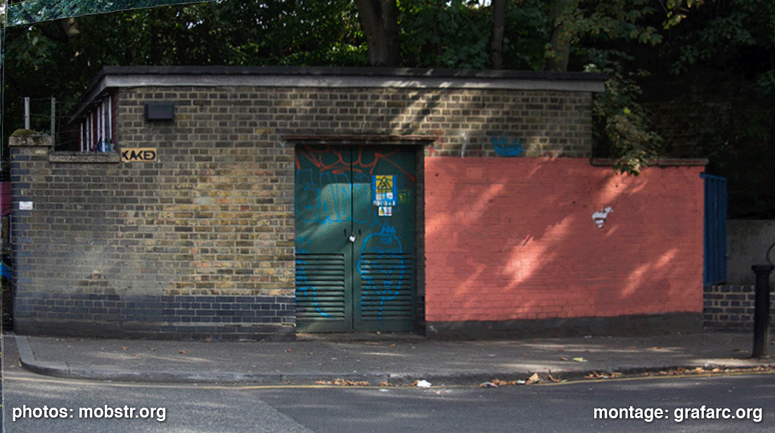
UK-based stencil artist Mobstr noticed something odd about the way a wall in his neighborhood got buffed, so he decided to do a little psychological experiment, with hilarious results. I went ahead and grafarc-ized it into an animated gif.
Sites of Respect
February 26, 2015 on 4:20 am | In global news, related links | Comments Off on Sites of Respect
Sites of Respect from Cameron McAuliffe on Vimeo.
Check out this video by human geographer Cameron McAuliffe from Sydney, Australia: Sites of Respect: Legal Graffiti Walls and the Moral Geographies of Young People. He spent 28 weeks photographing a set of seven legal walls in the Parramatta neighborhood of Sydney, tracking their changes on a weekly basis, until a newly elected conservative council ended the legal wall program and tore all the walls down.
Invisible graffiti that glows under UV
December 12, 2014 on 7:27 pm | In related links | Comments Off on Invisible graffiti that glows under UVWhat would you do with a can of spraypaint that’s invisible by day, but glows under black light? Check out Bilal Ghalib’s Glowffiti project for details. (via Golan Levin.)
Respect the alphabet. Support “Handselecta: Flip the Script”.
March 28, 2013 on 5:29 pm | In related links | Comments Off on Respect the alphabet. Support “Handselecta: Flip the Script”.I haven’t yet read Christian Acker’s new book “Handselecta: Flip the Script”, but from what I’ve seen, it looks like a thorough, scholarly, and invaluable piece of work. He’s compiled hundreds of interviews, tags, and alphabet samples from writers across the US, in a grand taxonomy and analysis of regional handstyles, the roots of all graffiti culture. I can’t wait to read it, and I’ll be first in line when he comes to San Francisco to speak.
If you’re as into this stuff as I am, you might want to show your support.
More graffiti robots
October 28, 2011 on 4:39 pm | In related links | Comments Off on More graffiti robotsSenseless Drawing Bot:
and Robo-Rainbow:
Retrieving buffed graf with QR codes
May 19, 2010 on 12:00 am | In related links | Comments Off on Retrieving buffed graf with QR codesBerlin-based artist Sweza has started an interesting project: on walls that have been buffed, he pastes up a QR code that links back to a photo of whatever was there before. Sort of a virtual geocached spin on the Graffiti Archaeology meme, one layer at a time: GRAFFYARD.

(via Art Crimes)
Serge Gainsbourg’s wall
November 7, 2009 on 10:07 pm | In global news, related links | Comments Off on Serge Gainsbourg’s wallSerge Gainsbourg – animation des graffitis sur 5 ans du mur rue de Verneuil from Arnaud Jourdain on Vimeo.
This video, by Arnaud Jourdain, documents five years of the history of a graffiti wall in Paris dedicated to Serge Gainsbourg. What’s brilliant is the way he does it: instead of just playing back the photos in series, he isolates each individual tag, puts it on its own layer, and explodes the whole glorious mess out into space with 3D animation. It’s a beautiful, fresh take on the Graffiti Archaeology meme. The wall itself, with love notes and other hommages interspersed among the tags and wheatpastes, reminds me of the John Lennon wall in Prague.
What’s keeping me busy
May 26, 2009 on 6:36 am | In related links | 1 Comment
Updates have been kinda slow on the site lately, mostly due to this new project I’ve been working on (see above). This is not a personal blog, but I had to post this shot here because of the sweet T-shirt Nate1 sent us from New Skool. Go check out his other wares, there are some excellent designs (I especially love the Krylon and headphones shirts!) Thanks Nate!
Calligraphic Packing
January 8, 2008 on 10:36 pm | In related links | Comments Off on Calligraphic Packing
What do you call a pocket full of chisel-tip markers? Calligraphic Packing! It’s also the name of a computer graphics research project from the University of Waterloo. My friend Craig Kaplan, a professor there, is a pioneer of “computational calligraphy”, a brand new research area that’s about to grow in some very interesting directions. Craig’s been interested in graffiti for a long time, for a lot of the same reasons I am. We each have our own ways of studying it, and his way is to take it apart, learn what makes it work, and write software that embodies that understanding. This project, led by Craig’s student Jie Xu, is the first step in what I hope will be a long and fruitful quest, as Craig puts it, “to probe the nature of letterforms and legibility”.
Entries and comments feeds.
Valid XHTML and CSS. ^Top^
59 queries. 0.094 seconds.
Powered by WordPress with theme based on jd-nebula design by John Doe.